Michelson Philanthropies
Michelson 20MM & MIPI Brand Identities

The brief
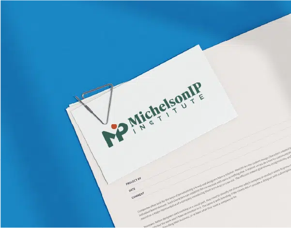
Michelson 20MM seeks to improve educational access and believes that higher education and employment opportunities should be available to all. The Michelson IP Institute champions the widespread understanding of IP fundamentals to empower students, educators, and budding inventors, entrepreneurs, and creators.
Six Half Dozen was selected to support these foundations by establishing new brand identities. For each entity, we created a branding package and website that reflects and captures their mission, while building awareness and sharing their impact.
20MM and MIPI are part of the larger Michelson Philanthropies group that directly supports vulnerable and underserved communities to catalyze transformative change and create a positive impact on a host of challenges in California and beyond.
Our Goal
Michelson sought to unify its portfolio of five foundations under a cohesive brand system. The challenge was to create a visual language that signals a shared parent identity while allowing each foundation to maintain its own voice and areas of focus. Our goal was to design a flexible identity system that balances consistency with individuality through a unified approach to typography and logo structure.
The Solution
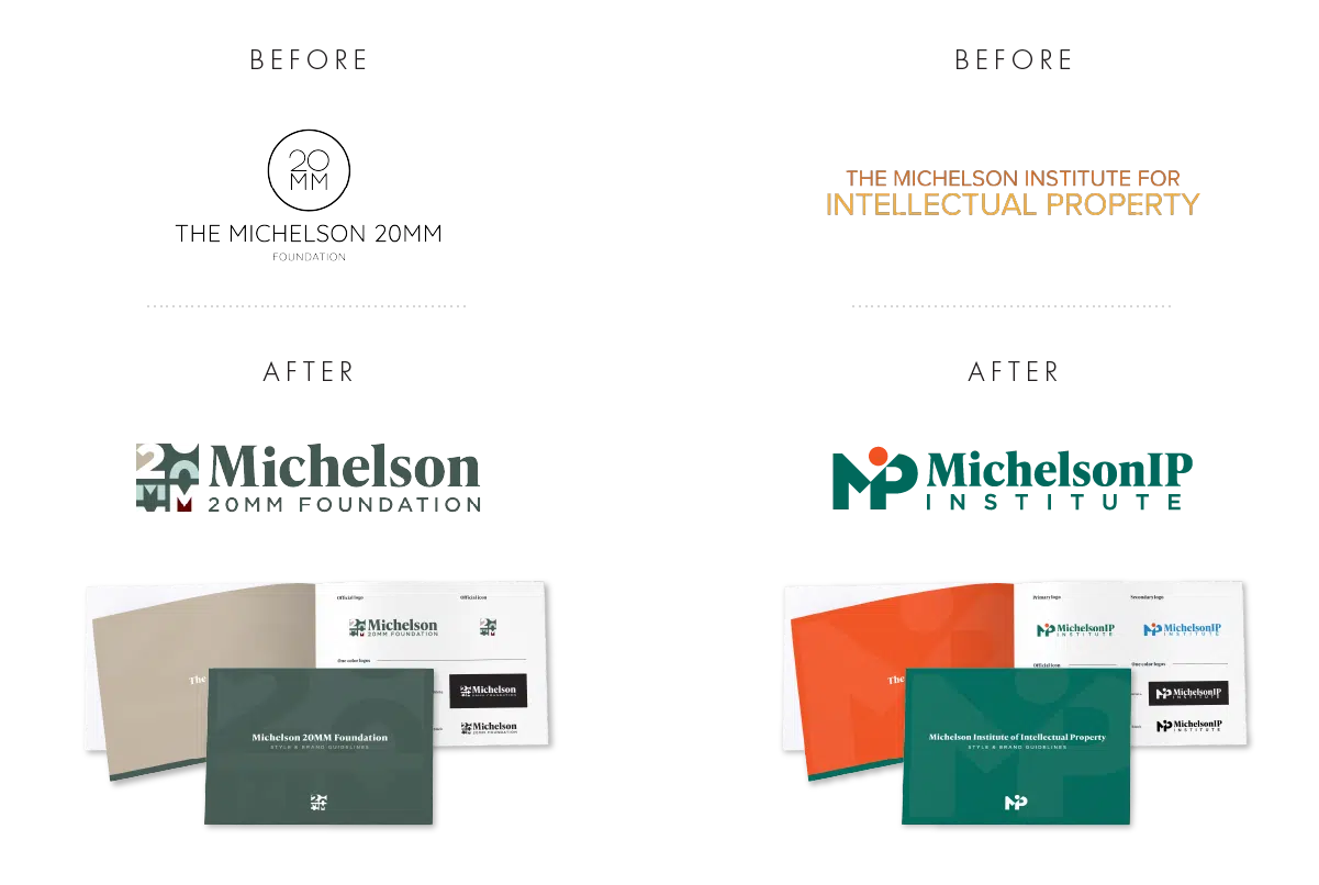
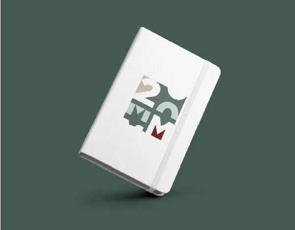
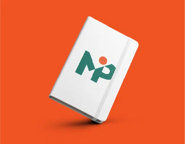
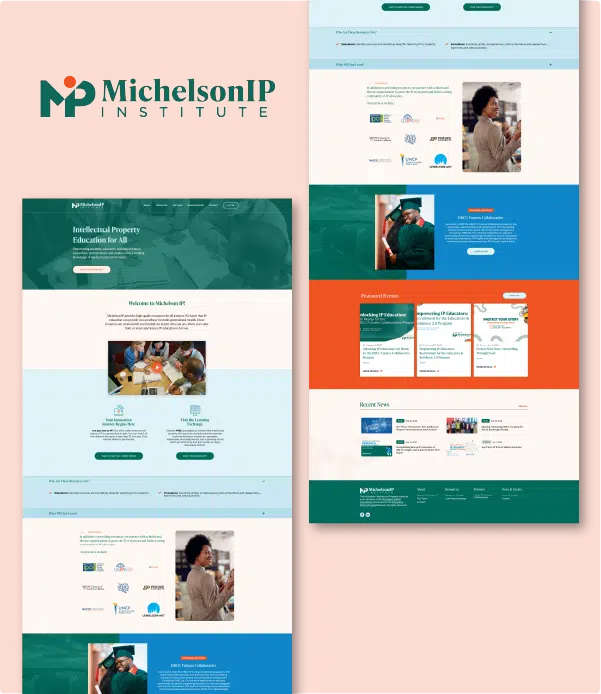
Building on the foundation established with the Michelson 20MM brand, we extended a scalable design system to the Michelson IP Institute. A shared typeface anchors the wordmarks across all foundations, creating immediate visual cohesion. Distinct icons and tailored color palettes were then developed for each entity, giving each foundation a recognizable and ownable identity. These elements were carried through to the website experience, reinforcing each mission’s tone and personality while maintaining alignment within the broader brand family.
The Process
Working closely with Michelson’s highly knowledgeable team, we became an extension of their organization, functioning as their dedicated creative partner. Following a comprehensive research and discovery process, we collaborated on possible directions and visual expressions. Multiple designers explored a range of icon concepts and logo lockups, resulting in a robust set of options.
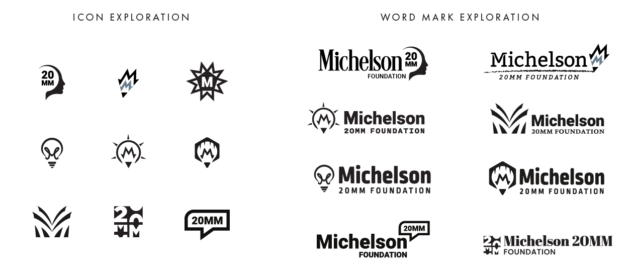
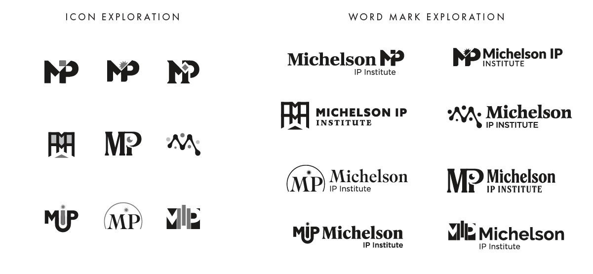
Through iterative refinement and client feedback, we evolved the strongest icon into a final brand mark and established clear brand guidelines to ensure consistency across applications.
From there, we transitioned to the design and development of the websites, bringing each brand to life through thoughtful, user-centered digital experiences that communicate impact with clarity and purpose.
The Results
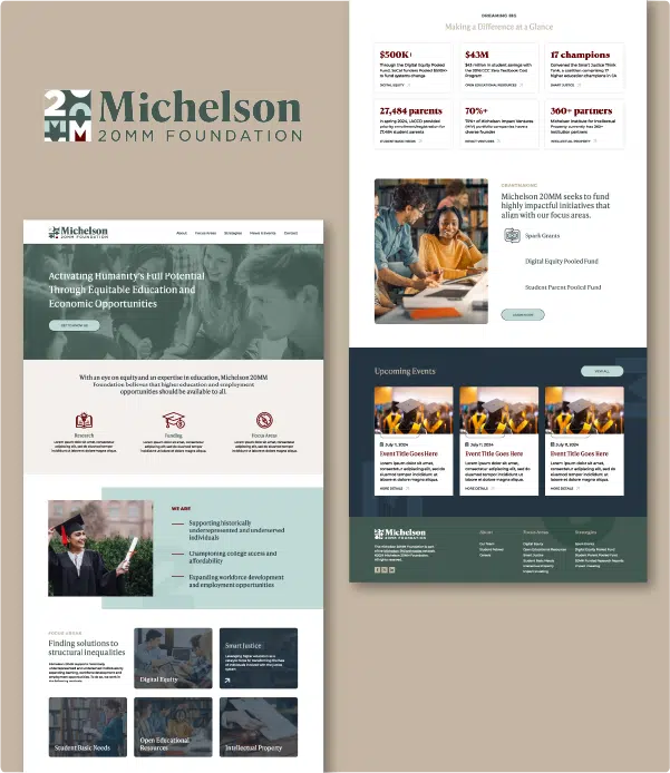
Through disciplined but flexible type & color treatment, we provided Michelson with a pair of distinct, yet interconnected brands. Each new website sports a modern look, smoother user flow, and improved navigation which resulted in 1,500+ members since launch, and 3,200+ user downloads for free IP resources.